Design, music, and city culture after dark
A festival site that feels live, crowded, and culturally specific before you ever buy a pass.
Nightshift is equal parts program guide, archive, ticket engine, and scene-builder. The homepage has to surface what is happening now, what a pass unlocks, and why the weekend feels worth organizing around.
The first screen should already be doing ticket and schedule work
People should immediately see the schedule, one standout session like Designing After Midnight, the featured speaker route for Amira Sato, and the archive year at 2025 that proves this is a living event with history.
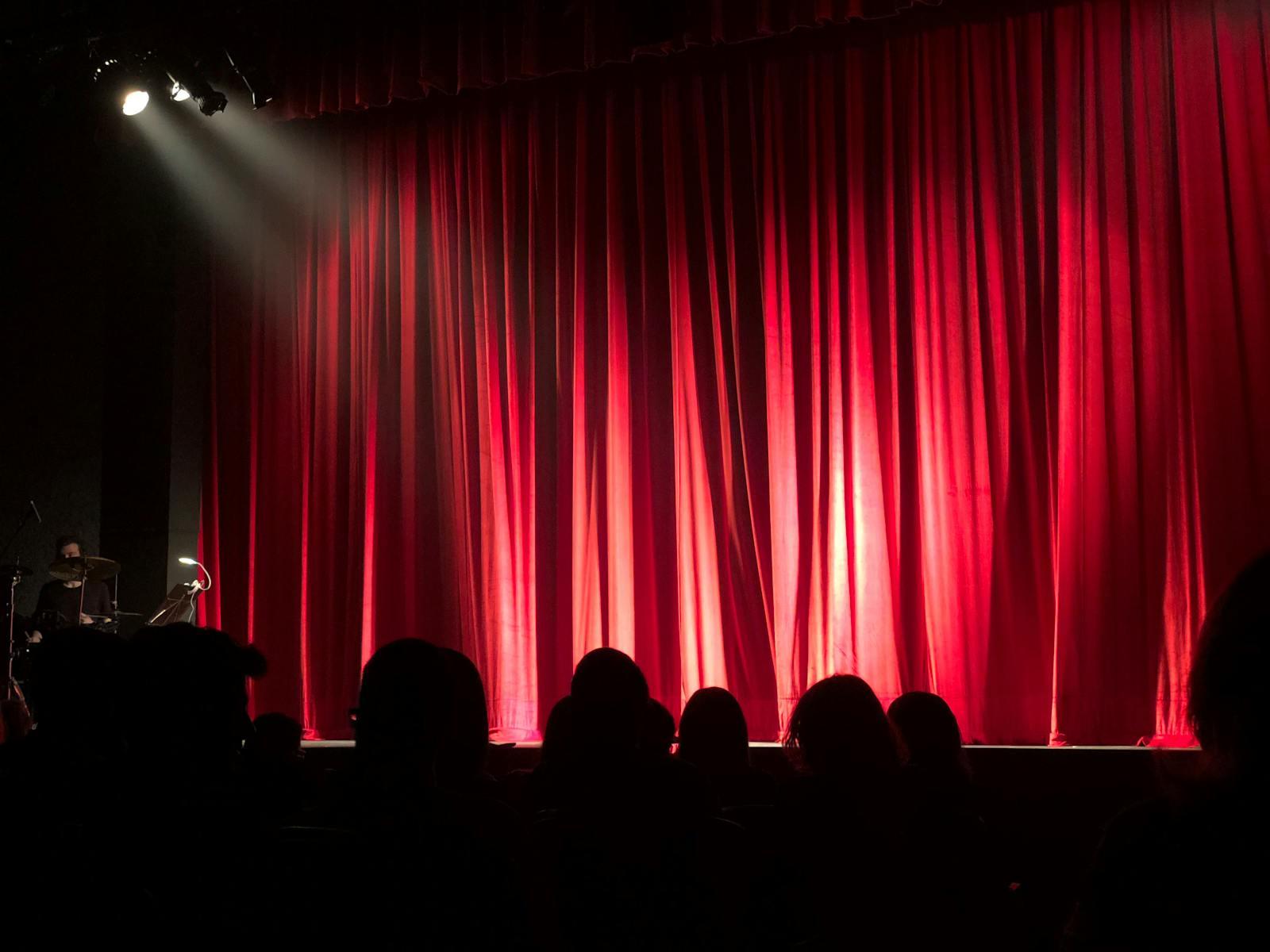
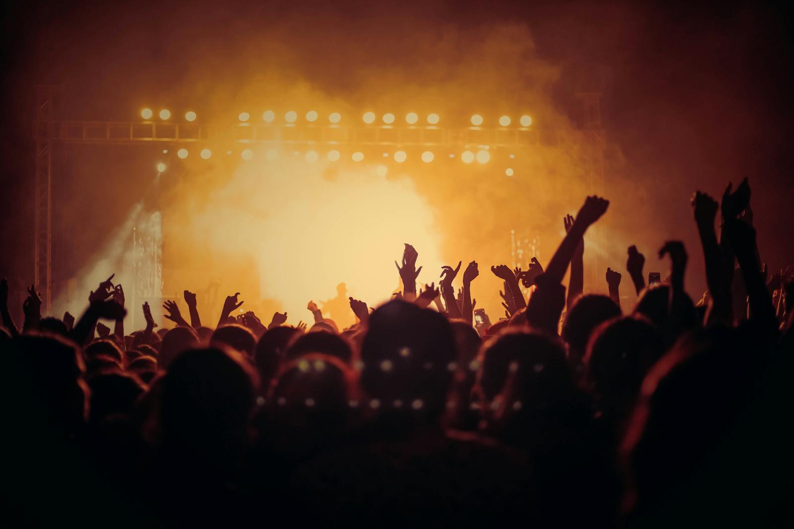
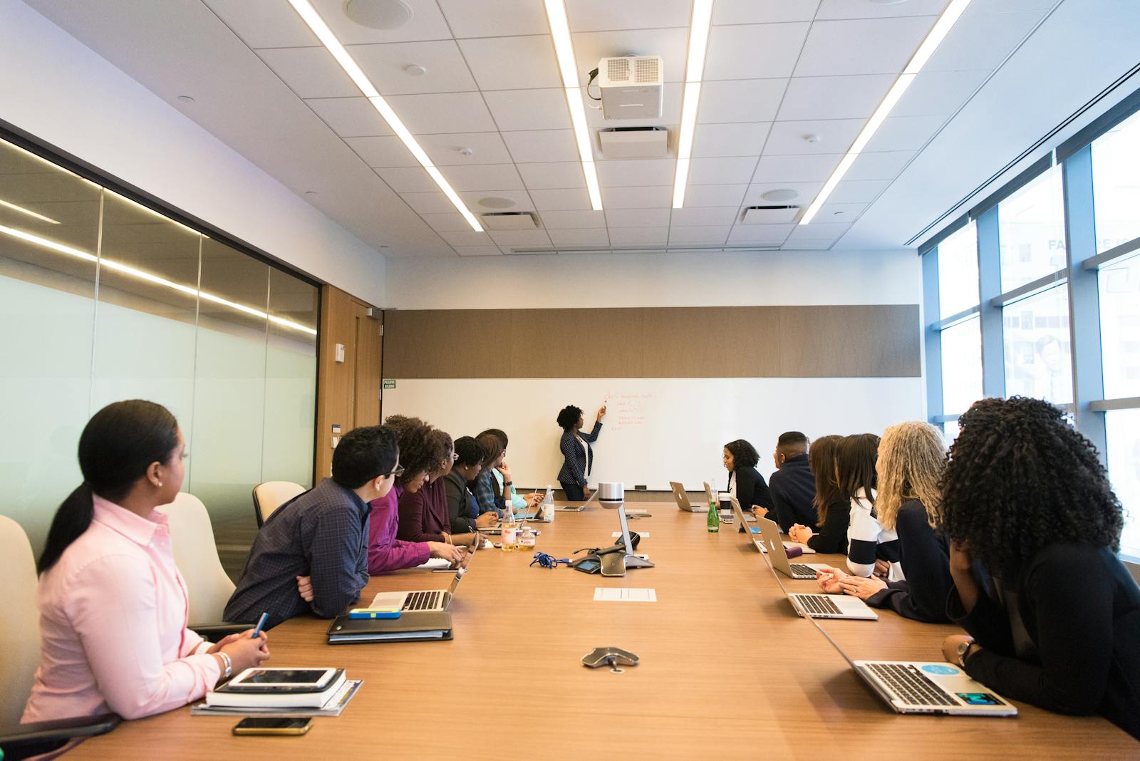
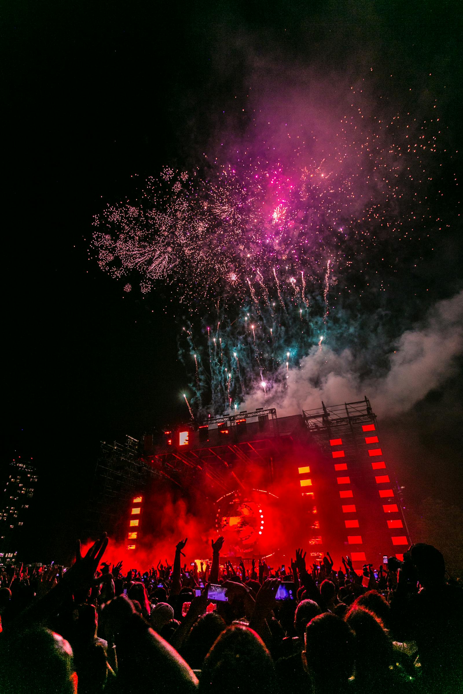
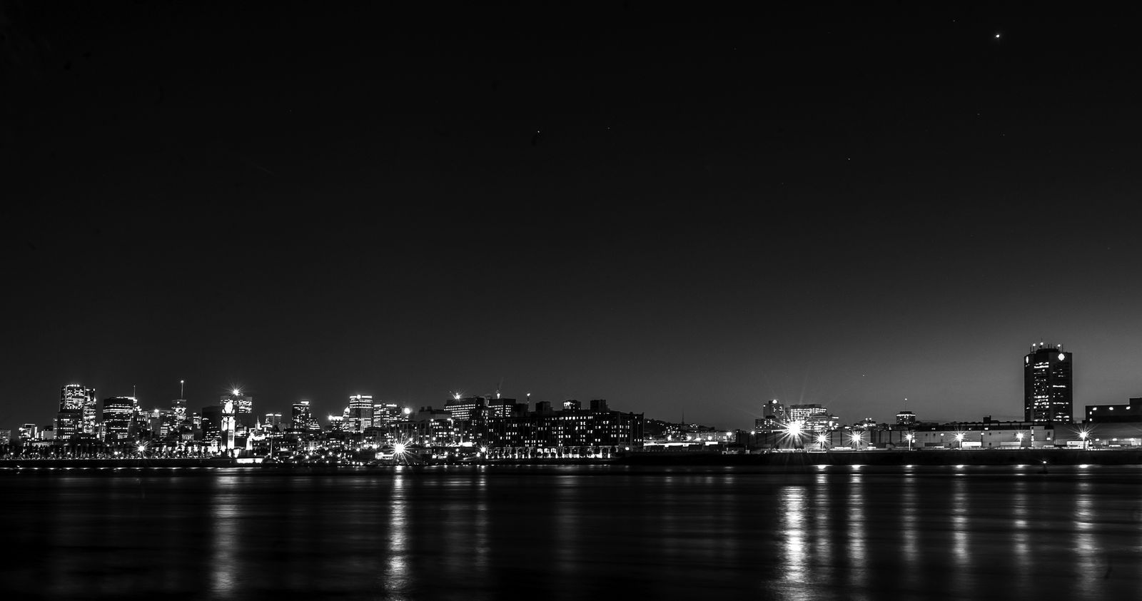
The visual language should feel like a real city event
The festival should feel like a weekend you have to enter physically, not just a conference website with a black background.

Why the archive matters as much as the current lineup
| Archive value | Current-year effect | Why it stays linked |
|---|---|---|
| Speaker history | supports credibility for new attendees | people want proof of past seriousness |
| Old schedules | create internal-link density and cultural memory | many events keep archive routes alive |
| Session recaps | bridge between editorial and ticket intent | old stories still recruit future buyers |
This site is intentionally messy in the way real festivals are messy
Schedule, speaker, session, venue, and archive routes all point to each other a little too often because that is what a real event team does when it is trying to make the whole weekend feel alive.
Start with what is happening and when
The schedule is often the first route, especially for people already considering a pass.
Jump into a session, speaker, or venue detail
People want a reason to care before they buy, not just a grid of times.
Use archive and sponsor proof to decide the event is worth trusting
Past years and partner quality do a lot of reassuring work in cultural-event commerce.
Common friction points
Why keep the archive so visible?
Because people use past years to decide whether a cultural festival feels real, worth traveling for, and likely to deliver on its current pitch.
Why link session and speaker pages so tightly?
Because festival intent is usually personal: one speaker or one session becomes the anchor reason to buy a pass.